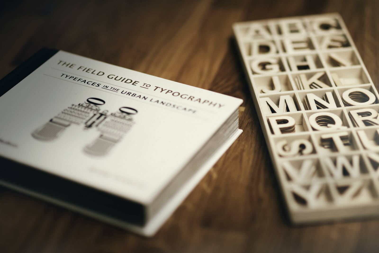
How to Choose Fonts for Videos
Fonts play a crucial role in creating engaging videos. Let’s look closer at how to select the best fonts for your project.

How to select fonts that look professional in a video
Font or a typeface is a set of features a character has: some tails, swashes, serifs, etc. It also defines leading and tracking (don't worry, we'll explain this terminology soon). This font definition makes it clear that there are as many text fonts as there are handwritings, id est infinitely many.
So, which one to choose?
Font types
All fonts can be divided into two main categories:
- Serif. These fonts have little strokes that extend off the character. This feature has just a decorative function, it makes text look "fancier". Examples: Times New Roman, Courier New, Didot, etc.
- Sans (sans-serif). These typefaces have no strokes and look simpler and neater. Examples: Helvetica, Roboto, Arial, etc.
There are also script fonts — an imitation of handwriting styles. The last category is decorative fonts; here only the sky's the limit.

Font characteristics
The characters themselves make just half of an impression. Other features that matter are the following:
- Leading. It's the space between text lines. In Word documents, for example, it could be single, 1.5 lines, or double.
- Kerning. Distance between two characters.
- Tracking. The same as kerning but refers to the whole text.
The larger these parameters are, the more legible the text is. On the other hand, it takes up more space on the screen.
How to choose the best fonts for subtitles
The primary purpose of any text is to transmit a message. When it comes to a music video title, captions, title sequences, lower thirds, or any other texts on video, they usually don't have much airtime and fastly disappear. That's why it's crucial that viewers can read the lines without any obstacles and nuisances.
A good practice is to use a sans-serif font, as it's typically more legible, especially if letters are small. Needless to say, fancy typefaces are also not welcome in social media reels, videos, stories, etc.
On the other hand, using a decorative font for a main title in capital letters may be a good idea.

Tips and hints
Choosing a typeface is more like an art, not a technology, so there are no strict rules of thumb. There are several good practices to follow, though.
- If you use more than one font, make sure they are not clashing. It's usually more natural if all your text elements have at least one feature in common: for example, all the fonts belong to one category or even font family. On the other hand, they shouldn't be too similar as well. Some contrast will do no harm.
- Try not to use more than two-three different fonts as your texts may look "scruffy".
- Don't forget about copyright. Not all the typefaces are free, so instead of asking yourself, "what is this font?" you'd better use tools or services, for example, video editors, that come along with built-in font libraries.
- And our traditional recommendation: think out of the box, as there are no ready solutions!
Hope it helps! And if you need some font inspiration, you can start with our short list of fonts for your next love video letter or holiday celebration.


